Your ecommerce website is getting decent traffic every day. But you’re not making enough sales and profit to fuel your growth. What if you could increase sales and drive your ecommerce growth?
The solution lies in discovering what encourages visitors to convert into customers. Your product page is where a majority of consumers decide whether to buy your product or leave the store.
But many ecommerce brands optimize their carts and checkout pages. However, if you want your visitors to get that far, you need to optimize your product pages to make sure they convert.
No matter how well you market your store, or how much traffic you get, you may not experience any improvement if you still have poorly-designed product pages.
You’ll obviously need to create solid product pages that can convince more people to add your products to their carts. Your product pages should tell them why your product is awesome and how it can help them.
Well-written product descriptions and impressive product photos can prove helpful. But there are many other elements that you need to put in place in order to make a great product page.
Optimizing your product pages for more conversions might get tricky. You may not know what to optimize, or where to start. To help you with this, here are a few actionable ideas on how to optimize your product pages to increase sales.
Table of Contents
#1: Optimize Your Product Images
When it comes to ecommerce stores, some people may be hesitant to buy products that they can’t touch or feel. But the next best thing you can offer them is visual proof of what they’re going to buy.
You should make sure that your product pages display high-quality images of your products. Images that don’t load properly or aren’t clear enough to showcase the product can drive your visitors away.
In order to increase conversions, you should use images that allow shoppers to see every single detail of your product. They should be able to view the product from different angles so that they can make sure it's really what they want. Preferably, you should include a 360-degree view of the product to properly entice and convince shoppers.
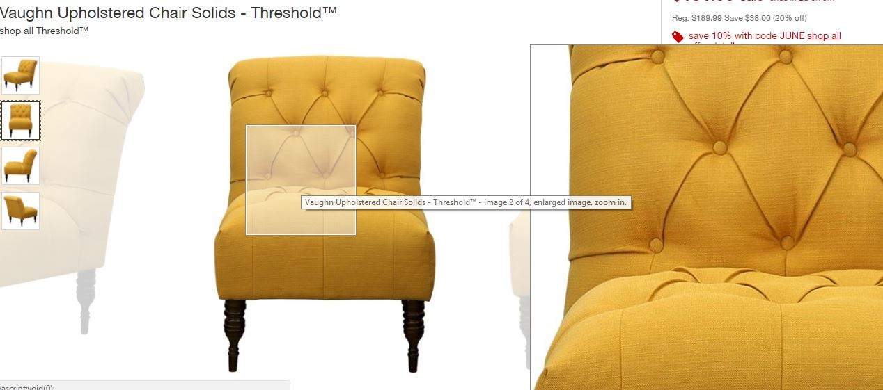
EXAMPLE: Target
Take a look at the quality of product images at Target. You’ll get a zoomed-in view of the area over which your cursor is hovering. And you can properly see all the details such as the texture of the fabric in the following product image.
#2: Create Compelling Product Descriptions
Your product descriptions are another crucial element to optimize. This is tricky because you need to optimize them for both search engines and users.
Optimizing your product descriptions for search engines can help you increase the visibility of your product in relevant search results. This can help you drive more traffic to your site that could translate into more sales.
To optimize your product descriptions for the search engines, you need to follow the most effective SEO techniques, including keyword optimization. Pick relevant keywords with high search volumes and low competition for each product page. You can then use these keywords in the product title and description.
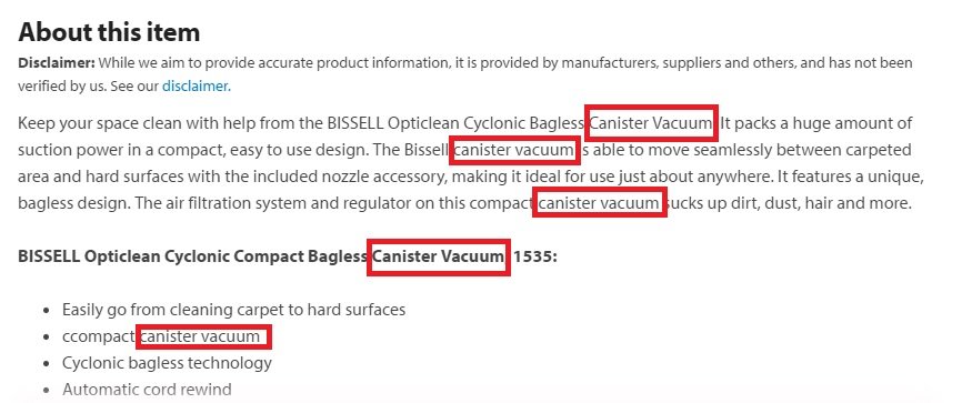
EXAMPLE: Walmart
The following product description from Walmart is an excellent example. You can see a keyword “canister vacuum” being used at least five times. But they way they’ve used it is natural and helps properly describe the product.
And instead of just copy-pasting product information from the manufacturer’s website, you need to create something original. The description should be enough to inform and entice shoppers at the same time.
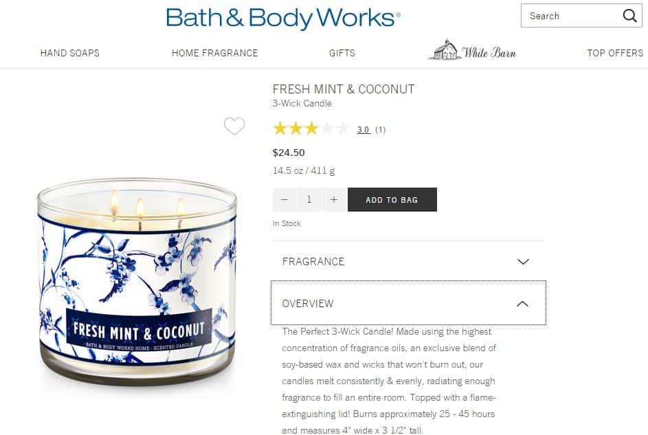
EXAMPLE: Bath & Body Works
Check out the following product overview from Bath & Body Works, for example. The way they’ve described the product and its features is enticing.
Instead of just saying that the product is made using soy-based wax, for instance, they say it’s made from “an exclusive blend” of soy-based wax.
#3: Provide Solutions to Prevent Uncertainties
Your product page should contain enough information so that shoppers don’t have to look somewhere else for information or abandon the website altogether. This means they’re going to leave the funnel and it’ll be challenging to convert them.
You need to use the page to address uncertainties and provide answers to the most common queries such as sizing information, shipping and return policies, etc. Make sure that you optimize the page to answer all of their questions so that they won’t abandon your site.
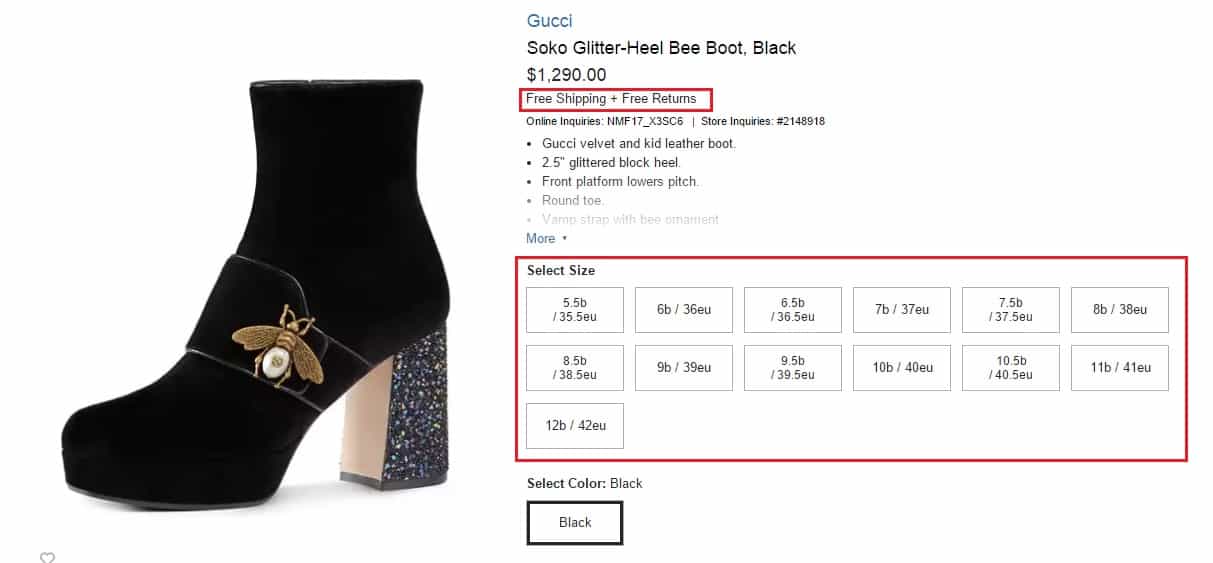
EXAMPLE: Neiman Marcus
The Neiman Marcus product pages do a great job of this. As you can see in the screenshot below, they display their free shipping and free return policies just below the pricing information.
And what’s great about the size selection chart on this page is that they display not only the U.S. size but also include the EU size. This can make it easier to shop for international shoppers.
You can also include product videos to address some common issues customers face.
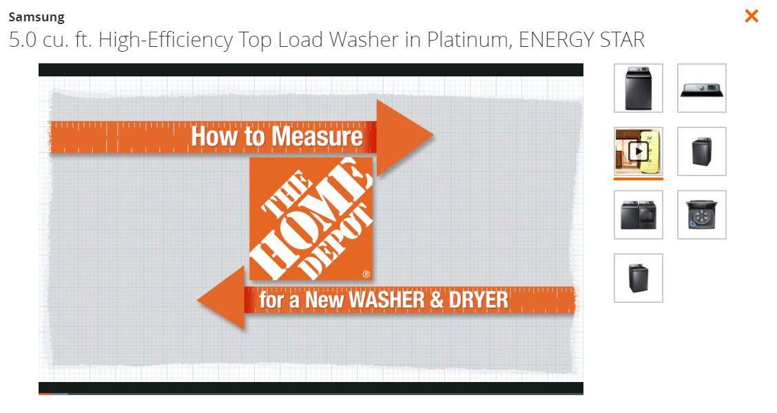
EXAMPLE: The Home Depot
At stores like The Home Depot, you get to watch a video guide on measuring for a new washer and dryer. Their product descriptions already provide details of the product dimensions.
But a video guide makes it much easier for shoppers to understand the product size in the context of their home. They can get an accurate idea of whether or not the product will fit in their house and meet their requirements.
#4: Provide Social Proof through UGC
If you’ve ever made an online purchase, chances are that you first read reviews from other customers before making your decision. You want to make sure that the company’s claims are in tune with claims from real people.
In fact, according to BazaarVoice, 51% of Americans trust content generated by other customers more than any other information on a brand website.
And a Deloitte study also found that online reviews or social media recommendations influenced the purchase decision of 61% of consumers.
So it’s only natural that you also optimize your product pages with user-generated content if you wish to increase sales. There are several ways to include UGC to your product pages. The most popular form of UGC is reviews, which most brands and ecommerce websites have implemented.
But you can go one step further and also include user-generated photos on your product pages. You can invite customers to post photos using your products on Instagram and other social media platforms with a unique hashtag. You can then collect these photos to further optimize the respective product pages.
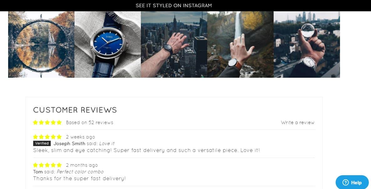
EXAMPLE: Lord Timepieces
You can see a good example of this tactic in use on the Lord Timepieces product pages. As you can see in the screenshot below, their product page features customer reviews and ratings.
But there are also pictures of real people on Instagram wearing or styling the watch. This puts your product in context and also acts as visual proof of the quality of your product.
User-generated product photos can help you build trust and credibility and optimize your pages for higher sales.
#5: Recommend Products Based on Customer Behavior
If you haven’t focused on providing your shoppers with a personalized shopping experience yet, it’s high time that you do so. Personalization can help you build customer loyalty and increase the chances of repeat business.
You should take the time to optimize your product pages for an improved user experience. You can make customized product recommendations based on a customer’s browsing history, preferences, or purchase behavior.
Many ecommerce stores also display products similar to what a user is viewing. Some of them recommend products from the category in which the user makes the most purchases while other suggest products that go well with the item the user is currently viewing. All of this can impact the store’s conversions and revenue.
According to Accenture, 40% of consumers have abandoned a website because they were overwhelmed by too many purchase options, which made it difficult to make a decision. But with personalized recommendations, you’ll be highlighting only the products that the customer is most likely to be interested in.
The same study also found that 58% of consumers are more likely to buy from a retailer that personalizes their experience by recommending products based on their purchase history.
This is probably why websites that implement personalized recommendations on their product pages experience high conversion rates.
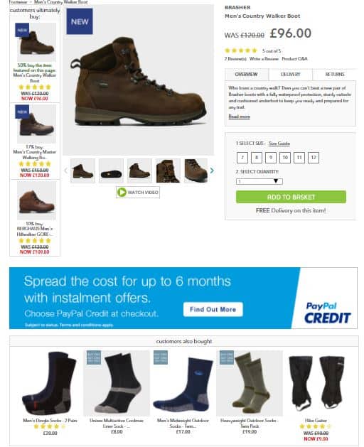
EXAMPLE: Millets
For UK-based retailer Millets, there was a 332% increase in conversion rates with personalized product recommendations. And for another UK-based retailer Blacks, the conversion rate increased by 277%.
In the following product page from Millets, for instance, you can see products that customers might need along with the item currently being viewed. For a pair of boots, you get recommendations for outdoor socks.
But there are different types of personalized product recommendations. And not every one of them can deliver the desired results. To further optimize your product pages for higher conversions, you need to know which type of personalized recommendations you should implement.
You can test different variations on your product pages to see which one is most effective. You can then optimize your product pages with that type of recommendations.
According an exclusive study conducted by Barilliance for MarketingSherpa, making recommendations based on, “Visitors who viewed this product also viewed,” resulted in the highest revenue.
EXAMPLE: GAP
Check out how GAP is using this technique to provide recommendations. This is followed by recommendations based on what other visitors ultimately bought.
Although it’s the most common type of personalized recommendation, “you may also like” ranks third in terms of revenue generation.
EXAMPLE: Hobby Lobby
Hobby Lobby optimizes their pages using this technique to provide a personalized shopping experience to their customers.
#6: Optimize Your Call-to-Action (CTA) Button
The ultimate goal of your product pages is to get people to buy the product. This means they need to be able to have a clear idea where to go or what to do if they wish to buy the product. An add-to-cart button that requires some searching and is difficult to find defeats this purpose.
You should optimize your CTA button to stand out. While you do want to maintain the aesthetics by making sure the button matches the rest of the page, there’s such a thing as making it blend too well. When this happens, it may be difficult for shoppers to understand what they should do to buy the product.
First of all, the color of your CTA button should contrast against the rest of the page. So whether you choose to use complementary colors or colors similar to the color scheme of your page, you’ll have little trouble if there’s a high contrast.
Just changing up the color of your CTA button could have a huge impact on your conversion rate.
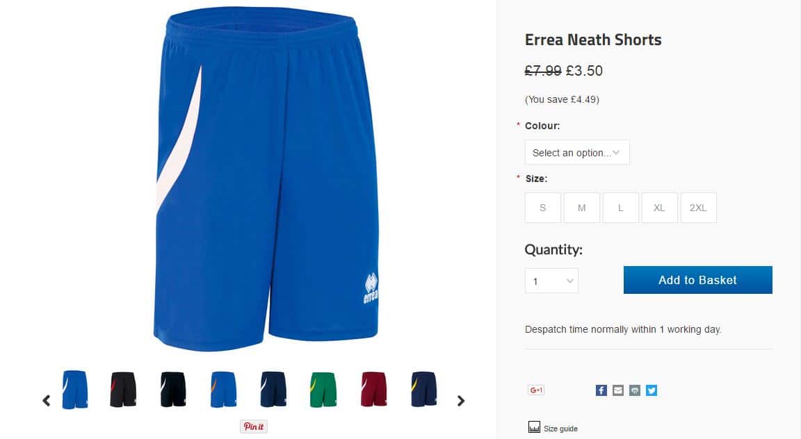
EXAMPLE: Andreas Carter Sports
According to BigCommerce, simply switching the CTA button from black to blue resulted in a 50% increase in conversions for UK-based sporting goods retailer Andreas Carter Sports.
But blue may not necessarily be the right color for your business. You can try testing out a few button colors to see which works best to increase sales. You can then optimize your product pages with the color that converts the best.
Additionally, there’s the question of where to place your CTA button to make sure it’s clearly visible. There may be benefits of adding the button below the fold if you’re selling a complicated product for which your customers need to consume some content first. But in most cases, placing it above the fold tends to work best.
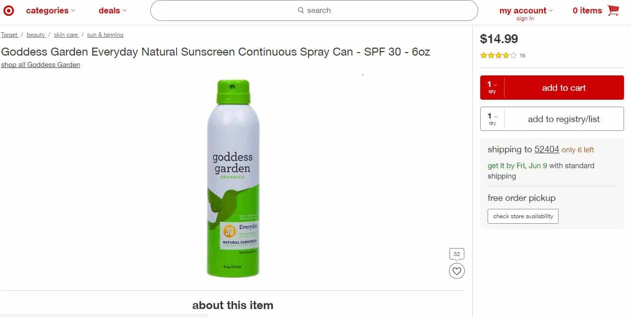
EXAMPLE: Target
Ecommerce giants like Target and Amazon also place their CTA buttons above the fold. Let’s also observe the CTA button color at Target. As you can see in the screenshot below, the button is in bright red, which is prominent and complements the store’s color scheme.
They also have another button, which allows visitors to add the item to their registry. However, this button isn’t highlighted. That's because the ultimate purpose of the page is to get people to add the item to their cart.
You should optimize your most important CTA button in a way that it grabs the attention of your visitors and compels them to take the desired action.
Like with the button color, the button placement would also require some A/B testing. You can use eye-tracking tools or heatmap tools to track user behavior. And try to see which regions of your product pages visitors are most likely to focus on. Try testing out these regions for CTA button placement and see which one converts best.
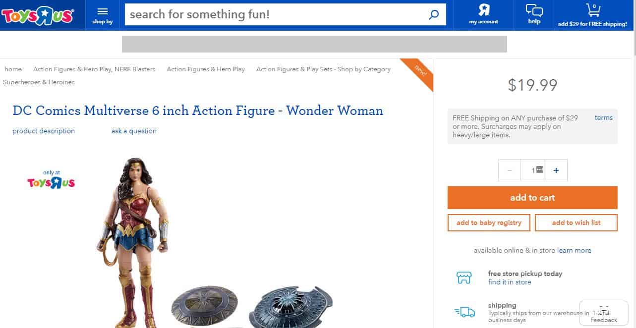
EXAMPLE: Toys “R” Us
Or you could copy Toys “R” Us and opt for a dynamic CTA button placement. The button is immediately visible above the fold when visitors land on a product page.
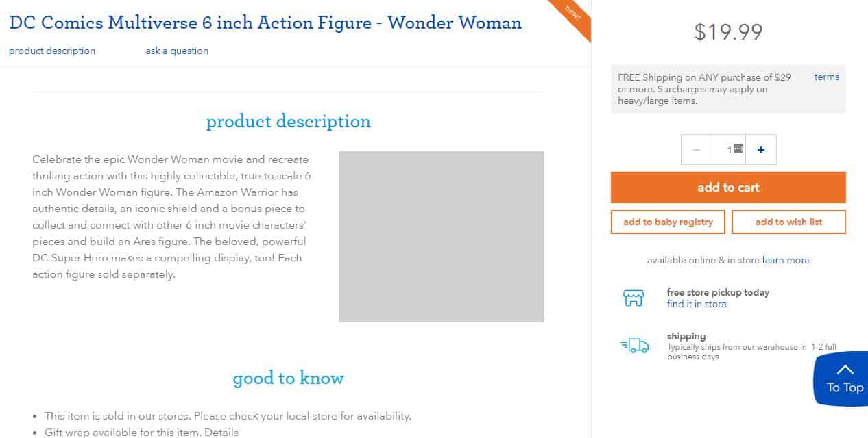
But even as they scroll down to learn more about the product, the button is still visible at the same location. You can see an example of this in the screenshot below. Even as you scroll down to read the product description, visitors can still see the CTA button on the right and can easily access it.
Conclusion
These are some of the best and most effective methods that can help you optimize your product pages to increase sales. But even if you make changes to your product pages according to these tips, you should always run tests on different page variations. This will help you identify how well the change is working for you. You can then make adjustments based on the results of these tests.
Did you find these tips helpful? Which one would you try out first? Let me know in the comments below. Or if you need some help optimizing your product pages to increase sales, just get in touch with me.





![41 best tools for building a profitable sales funnel in [year] 29 41 best tools for building a profitable sales funnel in 2021](https://shanebarker.com/wp-content/uploads/2020/08/41-Best-Tools-for-Building-a-Profitable-Sales-Funnel-in-2021.jpg)
![top 37 cro tools (free & paid) you need to try in [year] 30 top 37 cro tools (free & paid) you need to try](https://shanebarker.com/wp-content/uploads/2018/02/Top-37-CRO-Tools-Free-_-Paid-You-Need-to-Try.jpg)



Very informative article about optimizing product page to increase sales.
I agree with you that one of the most important factors of the product page optimization is optimizing product images. Thanks for the great info.