Ecommerce websites started as mere counterparts to physical stores. But over time, the ecommerce landscape evolved into a shopping ecosystem that involves multiple touchpoints and devices.
From allowing people to shop your products from anywhere, anytime, to facilitating customer data analysis and personalization, ecommerce is the need of all businesses.
A good ecommerce web design can help you reach, attract, and engage global consumers, and retain existing ones. You just need to ensure that your website is visually appealing, has a good user interface, and is optimized to rank higher in the SERPs (search engine results pages).
In this guide, I’ll provide you with an overview of ecommerce web design best practices and share examples from some of the top online stores.
You’ll learn:
- How to create attractive product pages.
- How to optimize your checkout flows.
- How to use visuals in effective ways.
By following my curated ecommerce web design tips, you’ll be able to build an ecommerce site that looks amazing and helps grow your business.
So, let’s get started.
How to Design Ecommerce Websites
There are two major focus points if you want to design an ecommerce website that keeps users engaged and helps them move down the sales funnel. One is “user engagement” and the other is “conversion rate optimization.”
I’ll walk you through what each of them means and tell you how to optimize every element of your ecommerce website design for achieving the final goal – SALES!
Focus Point #1 for Ecommerce Web Design: User Engagement
You can make ecommerce websites look as gorgeous as you want but if they’re not engaging your visitors, they won’t stick around. You need to grab the attention of your visitors the moment they land on your website and ensure they have an enjoyable shopping experience.
Here are some ecommerce web design tips to help you build a website that helps improve user engagement:
1. Keep Your Ecommerce Website Design Simple and Clean
You should always strive to maintain a simple ecommerce website design that is easy to navigate. Don’t clutter your web pages with too much information or images as this can make it difficult to browse.
Minimal ecommerce website designs are always more effective than complicated ones as they help visitors quickly find what they are looking for. They can help you close more sales.
So, remove unnecessary elements and designs that can distract users from the primary goal of purchasing your products.
Minimalistic ecommerce websites will also load faster, which can help you reduce bounce rates and engage more visitors.
2. Make It Easier for Shoppers to Find Your Products
Ensure that your ecommerce website has an easy and intuitive navigation structure. Here is how you can do that:
- Place your ecommerce website’s main navigation menu at the top of the homepage.
- Organize all your product listings using meaningful categories, subcategories, and labels.
For instance, if you’re a clothing brand that sells t-shirts, you can use labels like “Men,” “Women,” and “Kids” to categorize your t-shirt collection. - Including all important links in the main and footer menus of your ecommerce website.
- Create a search bar that helps users search for products across the website. You should place this search bar at the top of every page on your site. This will help users instantly find the products they want.
- Allow shoppers to use filters to easily find the products they’re looking for.
- Include “Add to cart” and “Buy now” icons or call-to-action buttons to help shoppers add items quickly and easily to their shopping cart and make purchases.
Following these ecommerce website design practices can help you make it simpler for customers to find and shop for your products, which will result in greater revenue.
3. Build Trust and Confidence in Your Brand and Website
Ensure your website inspires trust in potential customers.
- Include an overview of your business, the people behind it, your contact information, and your social media handles.
- Add a frequently asked questions (FAQ) page to answer common queries about your business.
- Ensure that your shipping, return, and refund policies are easy to find.
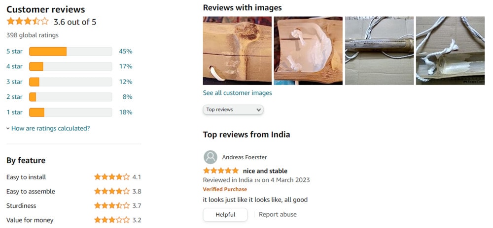
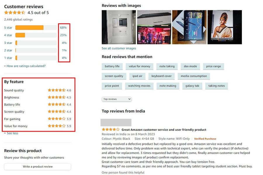
- Include customer reviews and ratings for each product. Also, display the number of customers who have rated the product.
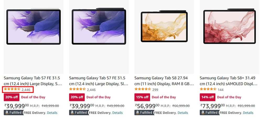
Along with detailed customer reviews, help shoppers gain insights about the features most users love or hate about your product. Make it easy for them to find good and bad reviews and reviews that mention a particular feature of your product.
- Build a secure checkout process. Add recognized trust seals to assure shoppers about the legitimacy and security of your website.
- Provide ample customer service options to help customers trust that your support team is accessible to resolve issues quickly.
- Use high-quality images and detailed product descriptions to build trust and credibility.
4. Maintain Transparency
Give easy access to essential business information.
You can do this by including:
- An “About Us” page with an overview of your business
- Your contact information
- A clearly visible link to your privacy policy
- Shipping and delivery information
- Returns and refund policy
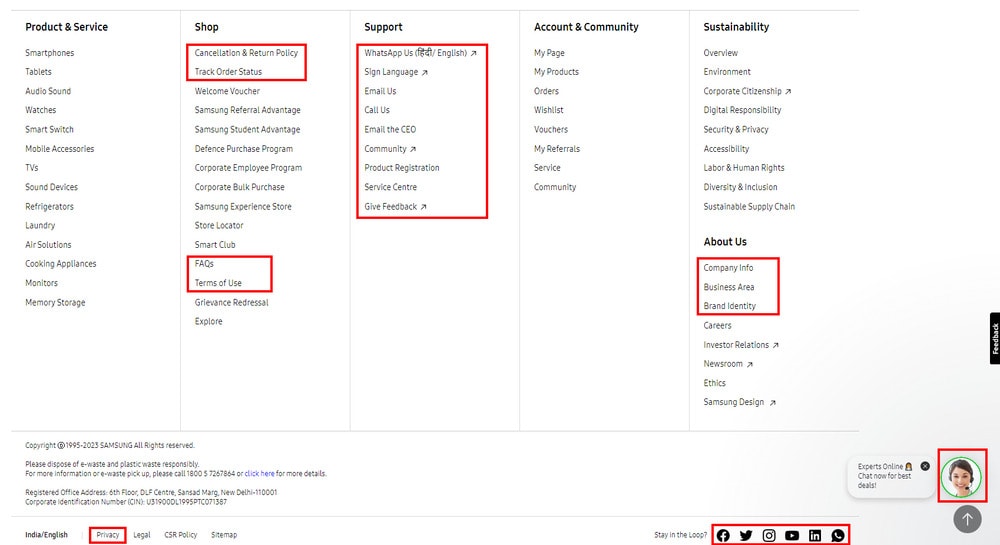
For example, Samsung has created an elaborate footer section with all crucial links and information that a shopper can look for.
5. Choose a Mobile Responsive Website Design
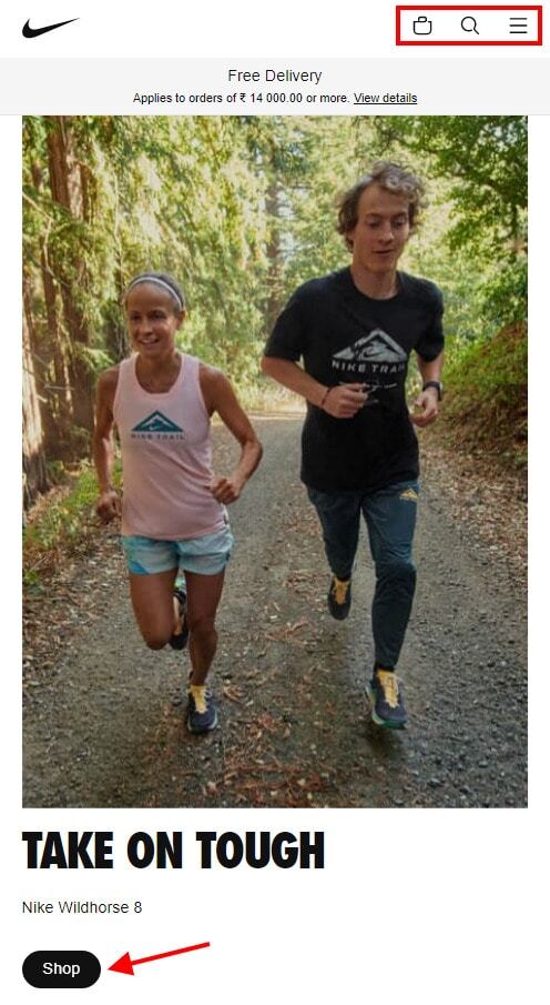
Mobile ecommerce is becoming increasingly important as customers are increasingly turning to their mobile devices when making purchases. Therefore, you should design your ecommerce website with mobile devices in mind.
- Ensure that your ecommerce web design is responsive and intuitive for smaller screens. It should allow visitors to easily access all of the important features, offers, pages, policies, and products in no time.
- Position your calls-to-action (CTAs) properly, above the fold. Especially, your “Add to cart” and “Buy now” buttons or icons should be prominently displayed.
- Prioritize speed as customers are often in a hurry when shopping on their phones. This is an important factor in optimizing your site for mobile conversions.
- Accept guest checkouts. This will help you convert shoppers who don’t have the time and patience to fill out a number of fields and complete the registration steps.
6. Create an Accessible, Inclusive, and Ethical Web Design
Inclusion and accessibility are essential components of ecommerce website design.
To make ecommerce websites accessible, you should:
- Be mindful of color contrast, ensuring that there is enough contrast between elements to make them legible for people with low vision.
- Provide text alternatives for any graphic elements, to ensure that visually-impaired users can access the information.
- Include audio and visual cues for those with hearing impairments.
- Incorporate accessible design principles into the ecommerce site, such as allowing users to adjust the font size and providing clear navigation labels.
- Test your ecommerce website design on multiple devices and browsers. This will help ensure that it is compatible with different platforms and works properly for all users.
See how Partake Foods’ website is accessible to people of all ages and backgrounds. I’ve done a short video of the accessibility settings their website offers.
Focus Point #2 for Ecommerce Web Design: Conversion Rate Optimization
Design each of your pages well to lower psychological barriers and help your customers move down the sales funnel. Help them move faster from your homepage to category pages, product pages, cart, checkout, and, finally, to the checkout confirmation page.
Let’s discuss how you can optimize your website for conversions at each step, one by one.
1. Create an Impressive First Impression with Your Homepage Design
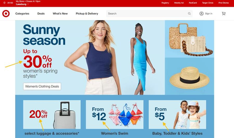
Your ecommerce website’s homepage is the first point of contact with your customers, so it needs to be attractive and catchy. Your ecommerce web design should be focused on engaging visitors and persuading them to dig deeper.
You can do this by following these ecommerce homepage design tips:
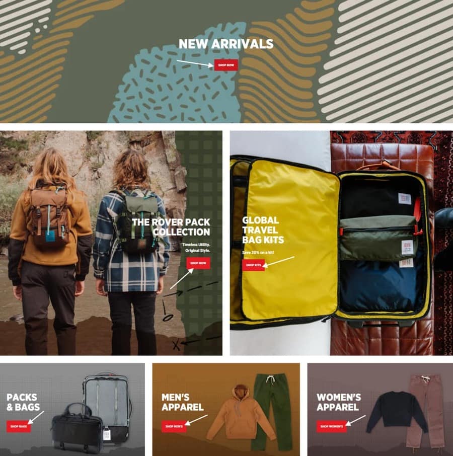
- Include calls-to-action (CTAs) like “Shop Now” and “Learn More” throughout the page to encourage visitors to take further action.
- Showcase popular products, bestsellers, or new arrivals to draw customers' attention.
- Use visuals like product photos or videos to demonstrate what you’re selling and provide an enticing glimpse into your ecommerce store.
- Keep the design neat, minimalistic, and organized to avoid overwhelming customers with too much information.
- Create an ecommerce website that is easy to navigate and simple to use, so visitors can quickly locate the products they need.
- Display the latest products or promotions on the homepage to make sure visitors see what’s new and encourage them to explore further.
- Include customer reviews and testimonials to build trust with potential customers.
- Include easy-to-find contact information, so customers can reach out with questions or concerns.
- Display top or featured product categories to help shoppers explore more.

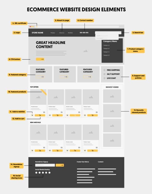
To help you visualize all of these elements together, I also created an ecommerce homepage design template/infographic. This includes all of the key components of a good ecommerce website design.
2. Engage Your Visitors with Well-Organized Category Pages
You can skip this if you only sell a few products but organizing ecommerce products into categories is a must for stores with a large inventory.
When properly done, categories can make it easier for visitors to find what they’re looking for and encourage them to take action.
You should:
- Include a short introduction of your product category.
- Organize ecommerce category pages with headings, filters, and sections to make it easy for visitors to find the product they want.
- Organize categories into logical sub-categories.
- Provide on-page search and sorting options. Have a search auto-complete functionality.
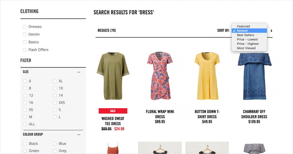
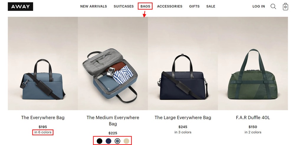
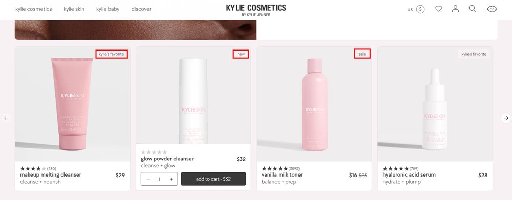
- Highlight your best-selling products with professional photography, customer reviews, color options, and pricing information. Show stock availability as well.
3. Drive Real Conversions with Detailed Product Pages
Design your ecommerce product pages with the goal of converting visitors into customers. Ensure they are informative and engaging, helping potential customers make a confident purchase.
Here's how you can optimize your product pages for conversions:
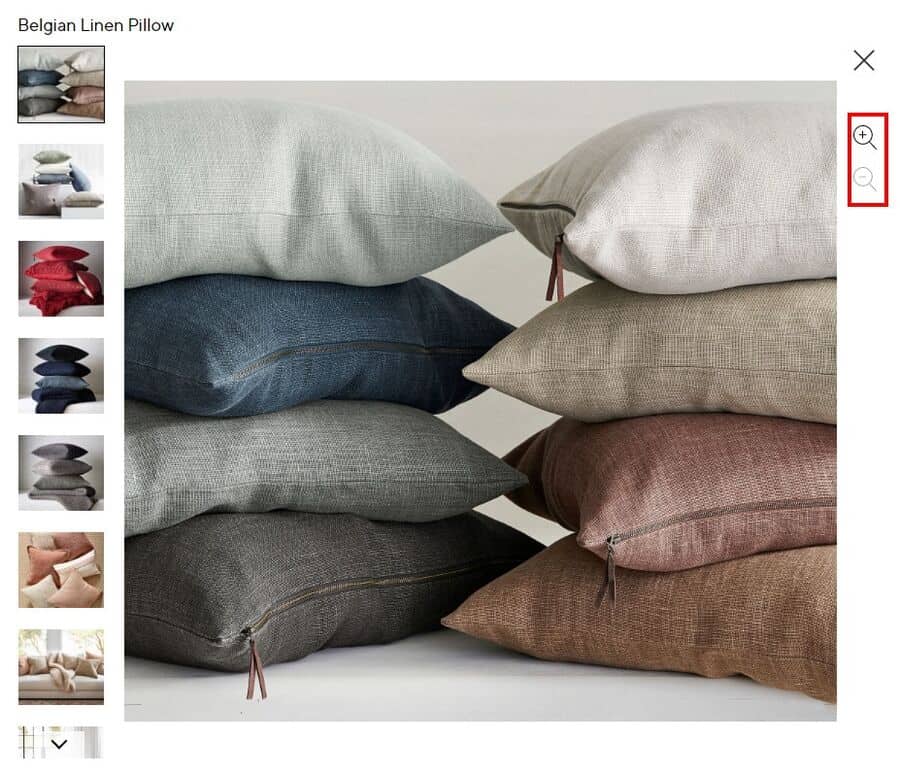
- Invest in high-quality, professional product photography to showcase your product in the best light. Let shoppers zoom into your product images to see finer details of the product.
- Include a 360-degree shot or video that shows off all of the important features of your product.
- Using a few in-context or lifestyle images of your product would be even better as they would help people visualize how your product can add value to their lives.
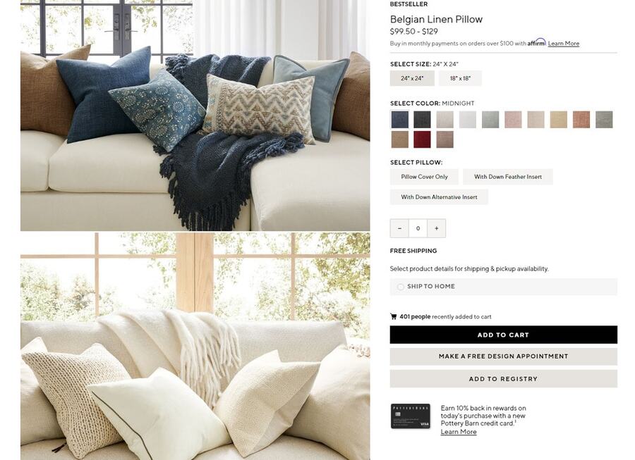
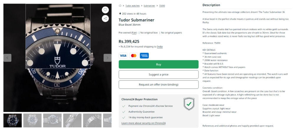
- Write detailed product descriptions that highlight your product's features, specifications, and materials used. Also, cover the benefits your product offers.
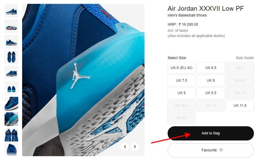
- Place a prominently-visible “Add to cart” button, above the fold. Use a contrasting color to draw shoppers’ attention.
Adding a “Favorite” or “Wishlist” icon or call-to-action button is also a cool addition to any ecommerce web design.
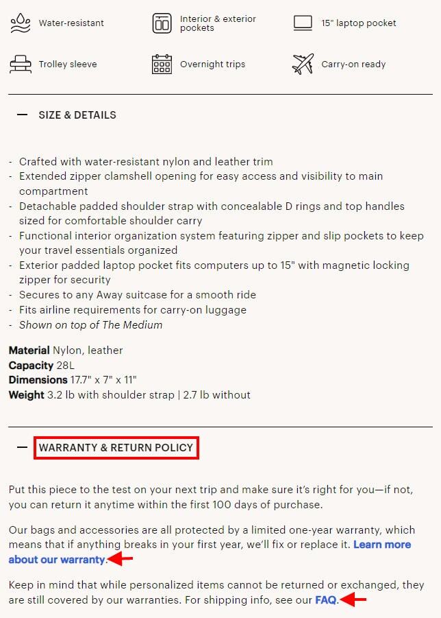
- Shoppers should also be able to find information about shipping, returns, and warranties quickly. Make sure these are visible on product pages.
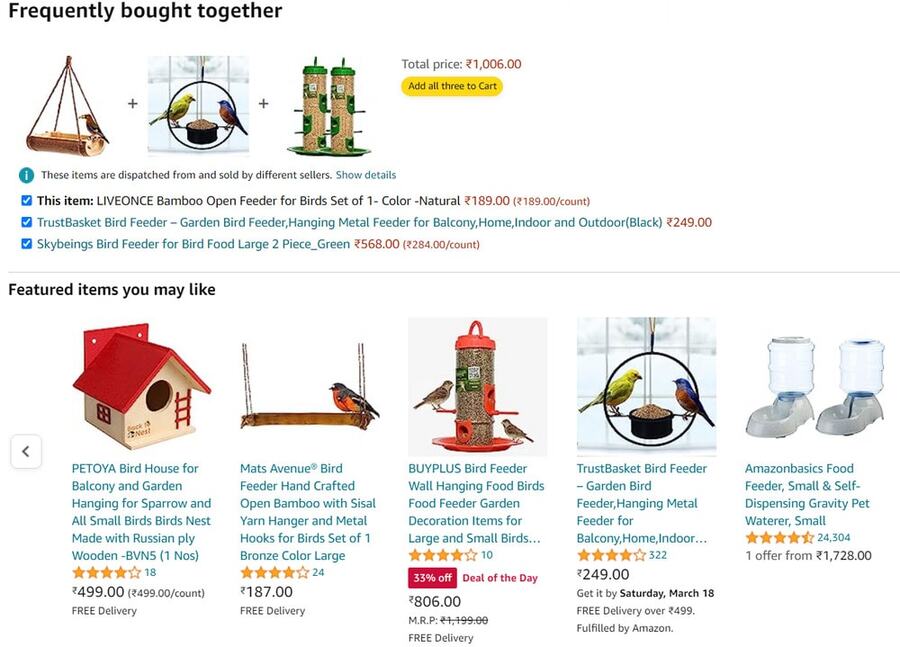
- Capitalizze on upselling and cross-selling opportunities by displayed related products on your product pages.
- Display customer reviews and ratings of your product. This will help build trust, as shoppers can see what other people think of the product they’re considering to buy.
4. Close the Deal with a Seamless Shopping Cart and Checkout Experience
A shopping cart is obviously one of the most important elements of any ecommerce website that stores items for the customer to purchase. You should focus on delivering a seamless checkout experience to your buyers.
Here are a few tips to optimize your shopping cart and checkout experience for conversions:
- Display a “cart” icon(
) or button at the top bar. It should be easily visible to shoppers as they browse throughout your ecommerce website.

- It should be easy for buyers to add items to their shopping carts and proceed to the checkout page. Use a simple and clean design. Keep it one page long with clear labels and no irrelevant information.
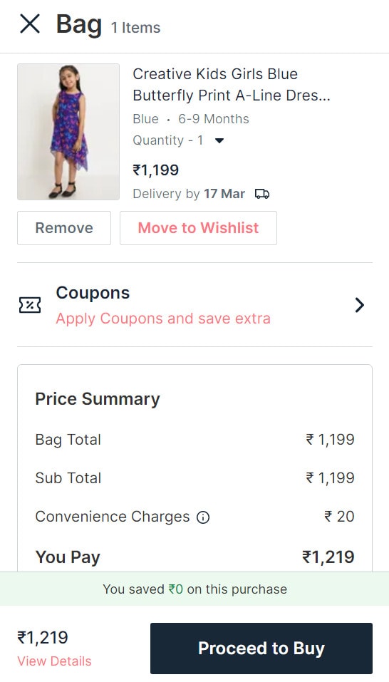
Have a prominent “Proceed to Checkout” or “Proceed to Buy” button.
- Allow customers to check out as a guest, and offer easy form-filling and multiple payment options (such as debit/credit card, PayPal, Amazon Pay).
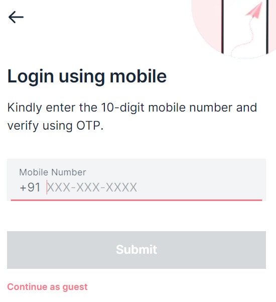
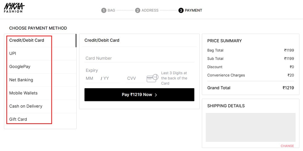
- Add trust signals that will help reassure shoppers that their purchases are secure, such as SSL encryption and a user-friendly refund policy. This will make customers more likely to buy from you.

- You should also optimize your checkout page for speed. Improving your checkout experience can help encourage more sales in the future and increase your customer retention rate.
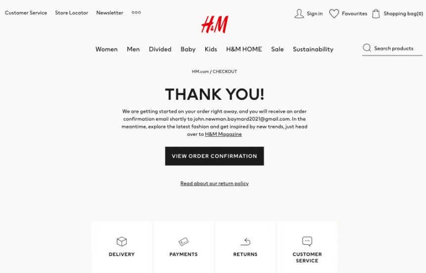
- Give order confirmation message after purchase. Include important links like return policy and customer service.
The Different Types of Ecommerce Websites You Can Build
The ecommerce website design process begins by determining the type of ecommerce website that best suits your needs. There are several types of ecommerce websites, each with its own unique features and requirements.
The most common ecommerce website types include:
1. Business-to-Business (B2B) Ecommerce Websites
B2B ecommerce websites are designed to facilitate ecommerce transactions between two businesses. This type of ecommerce design is often very sophisticated and includes features such as payment gateways, e-invoicing, e-catalogs, and secure document sharing.
One example of a B2B ecommerce website is Shopify. It has various ecommerce features that make it easy for businesses to create and manage their ecommerce websites.
2. Business-to-Consumer (B2C) Ecommerce Websites
B2C ecommerce websites are designed to facilitate ecommerce transactions between a business and individual consumers.
A lot of ecommerce websites are business-to-consumer such as Amazon. This type of ecommerce website design includes product listings, payment processors, e-coupons, e-rewards, e-gift cards, and other ecommerce tools.
3. Consumer-to-Consumer (C2C) Ecommerce Websites
C2C ecommerce websites are designed to facilitate ecommerce transactions between two individuals. Examples of C2C ecommerce websites include eBay and Etsy.
These ecommerce websites offer a platform for individuals to buy and sell products or services from one another. They also provide ecommerce tools such as payment, shipping, and return policies.
4. Consumer-to-Business (C2B) Ecommerce Websites
C2B ecommerce websites are designed to facilitate ecommerce transactions between a consumer and a business. Examples of C2B ecommerce websites include Upwork and Fiverr.
These ecommerce websites offer a platform for consumers to sell their services as a freelancer or a small business owner. These platforms also offer access to ecommerce tools such as payment, shipping, and return policies.
What Does a Good Online Store Design Look Like?
A good ecommerce website should have a clean and intuitive design, simple navigation, and an easy-to-use checkout process. It should also have visually appealing features, such as high-quality images of your products and clearly-defined product categories.
Your website content should be accurate and up-to-date, with a secure checkout process that is free of errors. Finally, it should offer customer service options, such as live chat and contact forms.
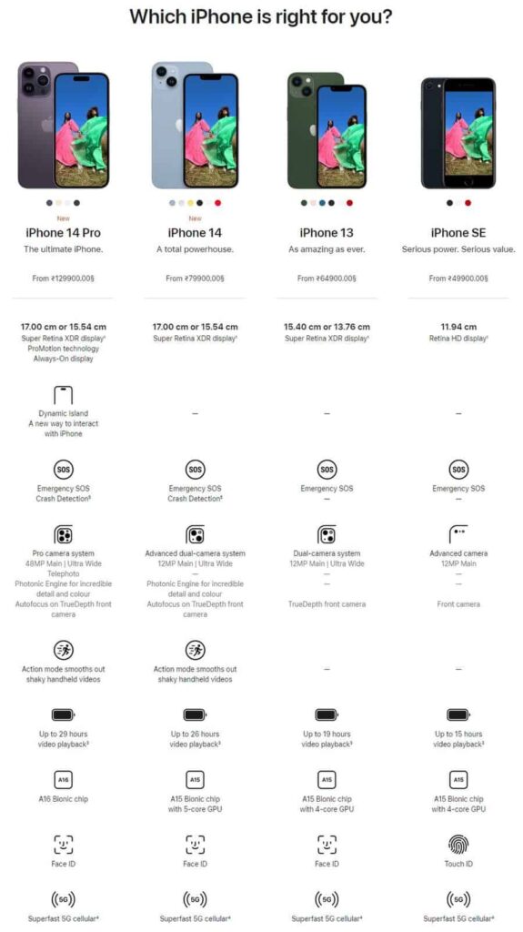
When designing your ecommerce website, make it easy for customers to browse and buy products with helpful filters, search bars, and product recommendations. Provide plenty of information about your products to make it easy for customers to compare features and pricing.
Also consider the visual design of your ecommerce website, making sure that visuals are optimized for quick loading and look aesthetically pleasing.
You can also incorporate interactive elements into ecommerce web design, such as product videos and customer reviews. This can help customers make an informed decision while shopping on your website.
Additionally, a good online store design should be optimized for mobile devices, which can help improve customer experience and boost sales.
3 Best Ecommerce Website Design Examples
To get you inspired, here are three ecommerce web design examples that stand out:
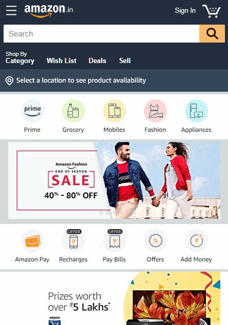
1. Amazon
Amazon is one of the largest ecommerce websites in the world and offers a wide range of products and services including books, clothing, electronics, and groceries.
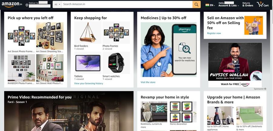
Here's what makes it one of the best ecommerce websites design examples:
- Professional and modern website design with a user-friendly navigation structure and easily-accessible product categories
- A search engine that allows customers to quickly find what they are looking for
- A streamlined checkout process that encourages customers to complete the purchase
- High-quality product images and videos to showcase products
- Customer reviews, product ratings, and interactive product pages to provide customers with the information they need
2. Zappos
Zappos is one of the most popular ecommerce website design examples out there. This ecommerce powerhouse offers a wide variety of items, from clothing and shoes to accessories.
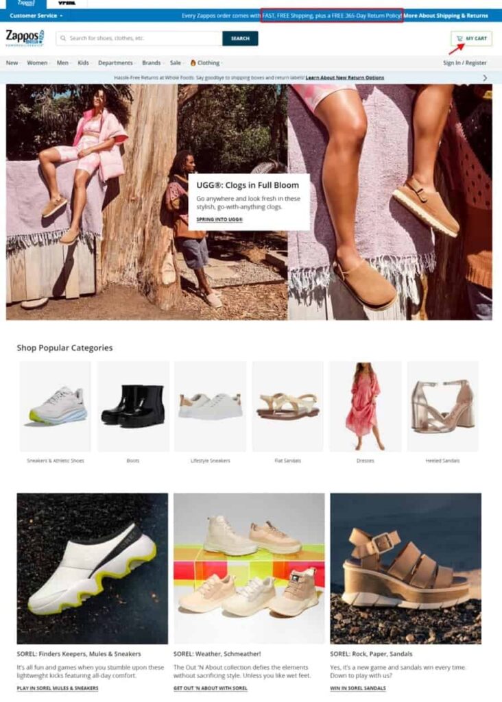
Its ecommerce website design is impressive for several reasons:
- An organized and visually appealing product display, making it easy for customers to find what they’re looking for
- Clear product details, offering plenty of information about each item
- Attractive product images and videos to showcase products
- An easy checkout process that saves customer information for future orders
- Fast and free shipping and an easy 365-day return policy
3. Etsy
Etsy’s ecommerce website design is perfect for creative ecommerce businesses and professionals. They use bold colors and eye-catching visuals to draw their customers in, while still maintaining a professional ecommerce feel.
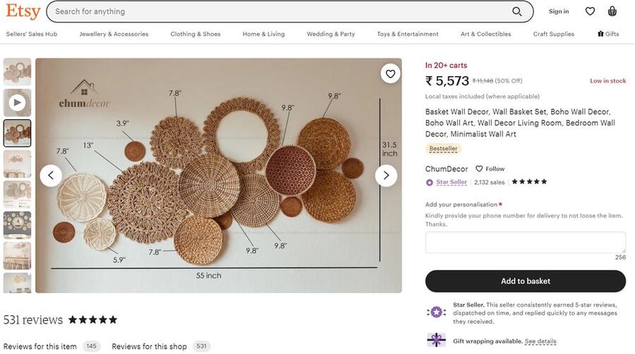
Here's what you can learn from Etsy's ecommerce web design:
- Simple and straightforward product pages
- The use of high-quality images to draw attention
- A great navigation system
- Integration of customer reviews and ratings to build trust
- An easy-to-use checkout system to ensure a smooth ecommerce transaction
FAQs
1. How can you create an effective ecommerce website design for your store?
To create an effective website design for your store, follow these steps:
Research and identify the kind of ecommerce website you want to build.
Choose your ecommerce platform that offers all the features and customization options you
need. BigCommerce and Shopify are quite popular.
Pick an ecommerce web design template that closely matches your expectations.
Add your brand identity elements like your brand’s logo, name, and contact information.
Create category and product pages and upload your product catalog.
Integrate shipping, delivery, and payment options.
Create pages like return and refund policy, privacy policy, and FAQs page.
Follow the other tips discussed in this article.
2. Which website builder is best for ecommerce?
BigCommerce, Wix, Shopify, etc. are all great website building platforms for ecommerce websites. They all have their own set of features, advantages, and disadvantages.
So, do your research and then pick the one that suits you best.
3. How much does it cost to design an ecommerce website?
With so many easy-to-use website building platforms out there, you can build a website almost for free. You do not even need to have any technical expertise or design experience to do so.
However, if you do want to hire a professional to design a custom website, then it can cost $10,000+. The cost will depend on how complex the website is and which platform you choose.
4. How should you choose a website design for your ecommerce store?
While there is no one-size-fits-all answer to this question, you should always prioritize user experience when choosing your ecommerce website design.
You want your customers to have a smooth, seamless journey from the moment they enter your ecommerce site until they check out. This means optimizing your website design for ease of use by ensuring:
– Streamlined navigation
– Well-developed product pages
– Fast loading times
– Eye-pleasing aesthetics that also reflect your brand identity
– High-quality images and visuals to captivate customers’ attention
– Dynamic content for personalized engagement
5. What is the cheapest ecommerce platform?
Among the top ecommerce platforms, Wix has the cheapest plans available.
BigCommerce and Shopify are more or less similar in pricing. But their comparatively higher price is justified by the features they offer.
Zyro and Shift4Shop (formerly, 3dcart) are also affordable options but they are not as scalable as platforms like BigCommerce.
6. How should I design the product page of an ecommerce website?
Your ecommerce product page design should include:
– High-quality product photos and videos that show off the best features of your product
– Zoom in and zoom out feature to let shoppers view your product’s fine details
– Detailed product descriptions that cover all crucial elements such as sizes, materials used, dimensions, durability, and color options
– Customer reviews and ratings
– Enough negative space
– A prominent “Add to Cart” button
7. What are things you should consider when creating an ecommerce website design?
While there’s a lot that goes into creating an ecommerce website design, here are some quick tips to get you started:
– Keep your ecommerce website design clean and simple.
– Make your site easy to navigate.
– Use high-quality product images.
– Add useful product descriptions.
– Make the checkout process easy and quick.
– Ensure that your site is mobile responsive.
8. Is GoDaddy good for ecommerce?
GoDaddy is a good option if you want to create a basic website without many advanced ecommerce functionalities. However, it is not the best choice for ecommerce websites.
9. Is GoDaddy cheaper than Shopify?
If you just compare the prices, then GoDaddy does seem cheaper than Shopify. However, it does not offer as many features, so, Shopify still provides more value for the money.
Are You Ready to Create an Effective Ecommerce Website Design?
An ecommerce website should not only be visually-attractive but also provide a hassle-free shopping experience. If your website design makes consumers feel comfortable, they are more likely to buy your products and return.
You should incorporate the ecommerce website design elements mentioned above to improve user experience. This will help you engage more visitors and encourage them to make purchases.
Need additional help to optimize your ecommerce store for conversions?I’d be happy to help you improve your ecommerce website design and conversion strategy. Please feel free to contact me here.
What to do next:
- Learn how to avoid mobile shopping cart abandonment
- Read my comparison of WooCommerce vs. BigCommerce to determine which is right for you.
- Learn ecommerce link building from Jeff Oxford, the Founder of 180 Marketing.
- Listen to Wayne Mullins as he talks about fixing your website for conversions on my podcast episode.


![top b2b ecommerce platforms for [year] 33 top b2b ecommerce platforms](https://shanebarker.com/wp-content/uploads/2022/04/Top-B2B-Ecommerce-Platforms.jpeg)
![11 best ecommerce platforms for small businesses in [year] 35 top 11 ecommerce platforms you can use for your small business](https://shanebarker.com/wp-content/uploads/2022/02/118-Top-11-Ecommerce-Platforms-You-Can-Use-for-Your-Small-Business.jpg)
![the world’s top ecommerce companies ([year] list) 36 the world’s top ecommerce companies [2022 list] (1)](https://shanebarker.com/wp-content/uploads/2022/06/The-Worlds-Top-Ecommerce-Companies-2022-List-1.png)
![25 best ecommerce tools to grow your business in [year] 37 25 best ecommerce tools to grow your business in 2022](https://shanebarker.com/wp-content/uploads/2021/11/Blog-Best-Ecommerce-Tools-to-Grow-Your-Business.webp)


Perfect!
Thanks a lot, I appreciate that.
This is a very nice blog. Thanks for sharing.
Thank you so much! I’m glad you feel that way.
Very informative article. Thanks again.
Major thankies for the article. Thanks Again. Fantastic.
Thank you so much! The pleasure is all mine.
Oh, that’s a detailed and wonderful piece of content. E-commerce website design elements that you have mentioned in this article are very useful for those who want to build an e-commerce website. Thank you so much for sharing this with us.
Thank you so much! I’m glad you enjoyed reading my post about e-commerce website design.
Brilliant Content Shane!
Hi Mobeen, thank you so much. I’m so happy to know that you liked my post about Ecommerce Website Design.
Thanks alot for this detailed information.